Uber design.md
Black and white, bold and blunt, with pills for everything you tap
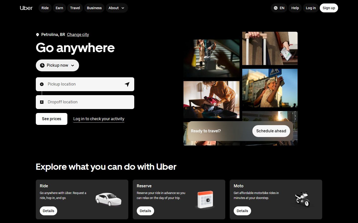
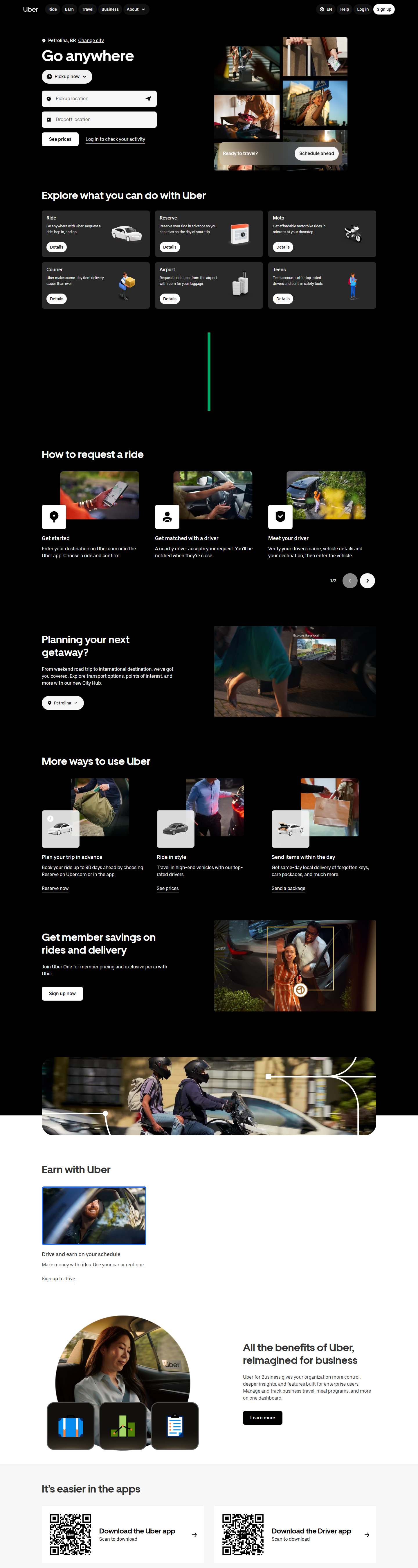
A strictly black-and-white utility: a pure black page, bold Uber Move headlines, a booking form with light-gray fields, white or black 8px buttons for the main action and rounded pills for every small control. No accent color at all; photography and small 3D illustrations bring the only color.
What “Use in my project” copies
Download https://faundr.dev/resources/design-md/uber/DESIGN.md and save it as design.md at the project root. It's a design guide inspired by Uber, measured from their site: follow its colors, fonts, corners and components on every screen you create or change. Where it calls for a paid font, use the free alternative the file names.
The real page
Captured from uber.com/br/en in English, at 1440 px wide.
Colors
Click a color to copy it. Roles are in English, as in the file.
Type and shape
UberMove
Free substitute: Inter Tight 700 (Google Fonts)
UberMoveText
Free substitute: Inter 400/500 (Google Fonts)
| Role | Size | Weight | Tracking |
|---|---|---|---|
| display | 52px | 700 | 0 |
| heading | 36px | 700 | 0 |
| heading-sm | 24px | 700 | 0 |
| subheading | 18px | 500 | 0 |
| body | 16px | 400 | 0 |
| button | 16px | 500 | 0 |
| body-sm | 14px | 400 | 0 |
| caption | 12px | 400 | 0 |
- tags
- 999px
- cards
- 8px
- inputs
- 8px
- buttons
- 8px
The files
Loading…
Screenshots and measurements taken by Faundr from uber.com/br/en for reference. Inspired by Uber, not its official design system; Faundr isn’t affiliated with Uber, and the name and marks belong to it.
Faundr
A design.md only works if someone checks it.
Faundr reads your design.md and checks every screen your AI touches: colors off the guide, rebuilt components, clipped menus, broken mobile.